Today, the success of the Cloud and new technologies has urged the majority of both public and private companies to publish online forms on their website, mostly to provide their clients with more information about their products and services.
However, how many people have tried to purchase a product or send a query but gave in because the online form was just too complicated to fill out? This means that the company involved has not only lost a direct sale because of a badly designed form, but also a prospective client and future sales.
Fortunately, following some simple guidelines when designing online forms can avoid a prospect from turning to the competition.
Pay Attention To The Design Of The Online Form
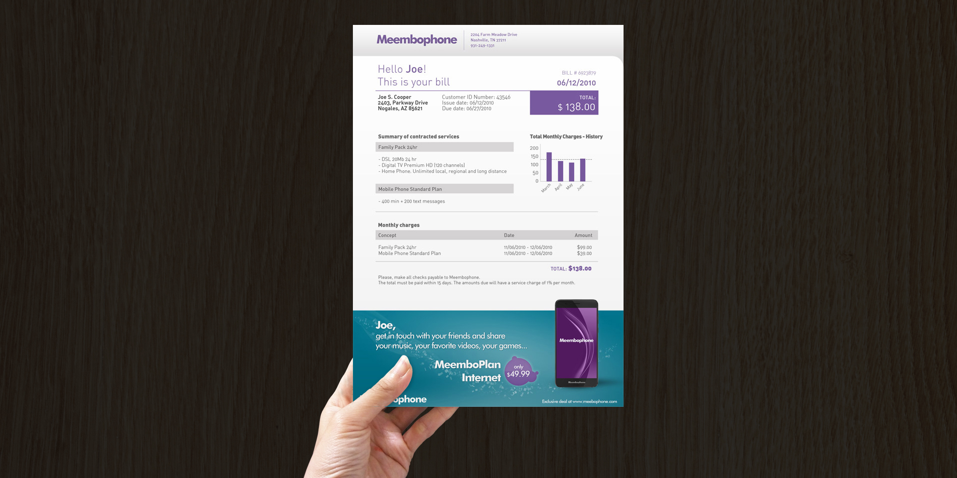
Obviously, it is not a positive thing to have complicated, tiresome and plain forms on your nicely designed Website. A good document management software offers its users a wide variety of design options to create good-looking, professional on and offline forms.
Make It Easy
Normally, it is boring enough to complete an online form without having to think about each answer. Therefore, try offering a list of frequent answers for each question, so your client only needs to select the most adequate one.
The Right Tools
It is vital to have the right tools in order to design professional online forms. For this reason, again, make sure to use a good online forms design and generation software that not only ensures professional form designs, but also provides the option of applying specific post-processes to your forms, such as email delivery, printing, etc.
Clear Instructions
A professional online form always includes a list of instructions that indicate the steps to follow and the goal of each step. Additionally, any field that may cause doubts must have some clear indications that make it easier for the user to complete the field.
Put Yourself In Your Client´s Shoes
When designing online forms, empathy is the most important factor. Put yourself in the user´s shoes. In most companies, the form design process is based on internal corporate processes that do not consider aspects such as ease of use.
A Design That Makes Sense
A basic element in form design is the use of colors. Logically, black and white is the combination that works best. However, you can try using other colors if they contrast enough to ensure that the text or image can be easily read and seen.
Comprehensible Text
Online forms most be suitable for a large public. This means that the type of language used must be neutral, clear and concise, any mandatory fields must be indicated, and the use of abbreviations and acronyms must be avoided.
Only Required Data
When requesting specific data online, the corresponding sections must be short and simple and only ask for information that is vital for the process. This way, the time needed to complete the fields is reduced, as well as the number of doubts about how these data will be used.
No Repetition
A lot of online forms oblige their users to enter the same information again and again. Generally, this is because this format facilitates management of online queries and purchase orders. However, as indicated previously, put yourself in the shoes of your clients to avoid causing unnecessary inconveniences that may encourage your prospects to turn to the competition.
Provide Feedback
When an online form has been correctly filled out and sent to your company, the user should receive a message confirming that the form reached its destination. In this case, an online document management system is vital. A good software tool will allow you to send automatic delivery confirmation emails and display informative messages during the entire process.
The indications above will only make a difference if the online forms are tested before they are loaded to your Website. This is the only way to ensure that the data collection is effective and meets the goals set. In conclusion, a good-looking and easy to complete online form can be, without a doubt, a gateway to a thriving business.
André Klein
Freelance Consultant for DocPath
