The use of the word usability is a quality attribute of interfaces, which refers to how easy and pleasant it is for users to use web pages and software programs, based on features such as quicker reading of text and loading of information and simplicity in interface menus. This is also part of the User Experience (UX), which refers to the global experience of a user when interacting with a product or system.
New Trends in User Interface Design
As software and technologies evolve at a dazzling pace, it is very difficult to extract precise information and establish new trends of thought. However, typically, interface usability is characterized by two main ideas: the Anglo-Saxon and the German or Nordic currents.
On the one hand, the Anglo-Saxon trend, such as Google’s search engine, is based on a more neutral and simple design, as well as enormous data bases and algorithms for data searches. The main advantage here is that users receive a large quantity of information. However, those large amounts of data also oblige users to filter and select the information they actually need.
On the other hand, there is the German or Nordic current, which is basically the opposite of the previously mentioned trend. It is characterized by complex, bright colors and more organized menus classified by themes. In this case, users have to make a certain level of effort entering their personalized search parameters, but they receive much more accurate and precise results. The software of T-Systems, a Germany company, is a perfect example of the Nordic current.
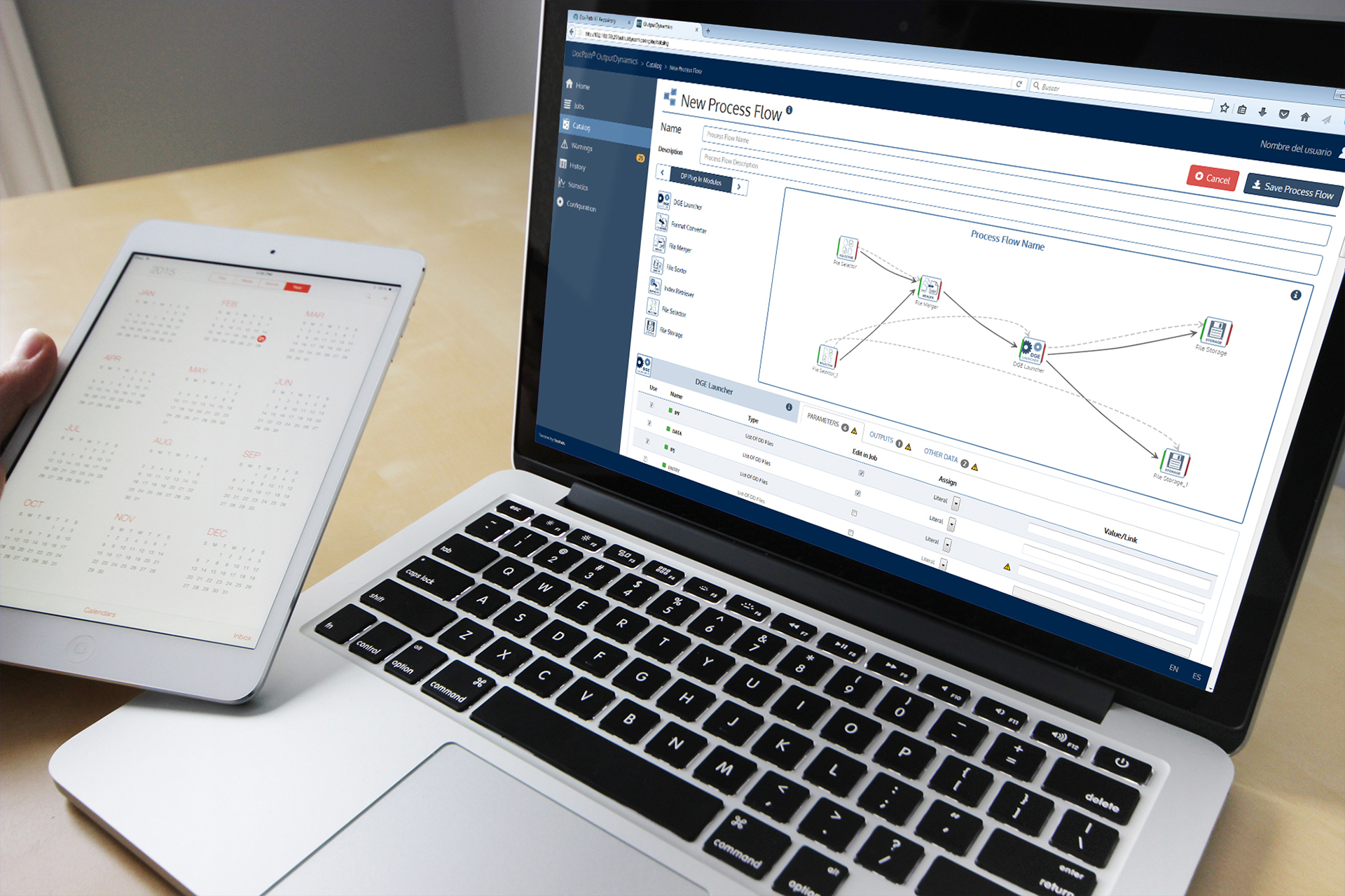
In the case of DocPath’s document software, its user interface design does not fit into either of these trends. The interfaces are based on a generic set of rules geared towards optimized usability and more specific guidelines, “The Golden Rules”, of user interface design.
General Rules for User Interface Design
- The ¨two-second¨ rule: Ideally, users should have to wait no longer than an average of two seconds for an application to load or change. If this process is delayed, a progress bar should inform users of the process status. Generally, the faster an app is loaded, the better the user experience.
- The “three click” rule: Users should be able to find any information with two, and no more than three, mouse clicks (or finger movements in the case of touch screens). The more clicks are needed, the higher the chance that the user leaves the page.
- The “inverted pyramid” rule: This concept, when applied to web page and interface design, affects the way the information is structured and prioritized. When more generic information is located at the top of the page and more specific data is placed at the bottom, then users can stop reading at any time and will still understand the most important elements of the page.
8 Golden Rules for User Interface Design
- Coherence: Coherent interface design produces predictable interfaces. Users will be able to predict where the different elements are located and how they work.
- Shortcuts: Frequent users should be able to use shortcuts. For example, cookies are useful to save personal information or to store the shopping cart from a previous purchase.
- Dialogue: Clear communication with the user is one of the primary concerns when designing a web interface. Users should always be aware of an application’s status, via well-written and concise text messages that indicate errors, confirm actions and give warnings. Providing feedback is also important, e.g. via status and progress bars.
- Control: Users should always feel in control and secure when using the application. This is achieved by allowing users to modify their personal data, change their delivery address for online purchases, etc. “Dangerous” buttons should be placed in secure positions and users should always be asked for confirmation in case of any modification.
- Proximity: The most important functions and information of the application should be clearly visible on the first page or in the main section of the interface, while less important elements can be positioned in a less visible spot.
- Familiarity: The UI learning curve should be smooth, meaning that users should be able to directly understand its core features without any training. Basing interface design on real-life concepts and images and common interface operations is key to achieving a familiar and easy-to-learn UI.
- Simplicity: The simpler is usually the better, as complex interfaces with numerous advanced options will only distract and frustrate users. The purpose of each element and control should be straightforward and the relationships between the different elements of an interface should be clear.
- Attractiveness: The interface should be visually appealing. The best approach is to use cold or warm colors that are in harmony with the concept or message that is to be transmitted.
In general terms, investing in good interface design which adapts to the user and incorporates human characteristics is crucial. Another vital element of good UI design is an outstanding testing team, to ensure that the application is free of errors, with correctly working controls and links.
The good news is that the above-mentioned rules are universally applicable. In other words, they can be used by both document software companies and large search engines.
Information resources:
http://desarrolloparaweb.blogspot.com.es/2010/01/reglas-y-principios-de-usabilidad-
http://www.guiadigital.gob.cl/articulo/que-es-la-usabilidad
andreasmarkessinis.com/blog/tag/diseno-de-interfaces/
André Klein
Freelance Consultant for DocPath
